.jpeg) |
| Adding flourishes to a letter by M. Slavin |
When I returned to lettering by hand, I first took a class from Yukimi Annand, a well-known calligrapher and teacher. We played with various tools: twigs, cola pens, (pens whose nibs are made from bent pieces of a soda can), bamboo, sponges, and balsa wood, anything we could dip into ink to make a mark. This abstract mark-making creates a totally different way of using letterforms from the traditional calligraphy that we find on certificates and diplomas. The lettering on certificates and diplomas has been drawn either with a pointed pen with its flexibility to create thick and thin lines or a broad-edged pen that needs to be turned to make thick and thin lines. Traditional calligraphy often requires years of study to learn the exact point to flare or turn a pen to make a letter correctly. In contrast, Yukimi's class let us experiment with letterforms in different ways.
.jpeg) |
| Mark-making using letters to form shapes |
While trying to find alphabets that I liked and could learn to do, I noticed that, much like other areas of creativity, calligraphers look for inspiration from each other and from trying new lettering styles. Pinterest is filled with modern calligraphy with its style of ignoring the baseline to write a word. Blackboard writing with chalk became visible at every restaurant for a while.
.jpeg) |
| Chalkboard writing poster by M. Slavin |
For the last couple of years, I saw a renewed interest in styles from the 1920s. The Neuland alphabet and Ben Shahn alphabets came from that period and are popular with letterers and calligraphers along with monoline lettering. As a left-handed person, I was attracted to these three for their ease of use as a lefty. They don't require the extreme hand manipulations of pointed pens or broad-edged pens that I needed to do to make the lettering beautiful. If you watch the TV series Gentleman from Moscow, you will that the background of the title is done in a Futuristic style similar to the artwork of Kandinsky, with a font that would have been selected by someone from those long ago times.
.jpeg) |
| Neuland alphabet & a MacIntosh alphabet version using different pencil weights |
Hermann Kilian's Built-up Capitals has appeared in workshops all over the country and online recently. In many of his designs, the words are drawn to touch each other with no separation between a line of words. The lettering becomes a design element so that the viewer has to stop to figure out what is said on the page. Each letter is a simple monoline with slight thickening at the tails and curves of the letters.
Here are some of my sketches using the Built-Up Capitals and Monkey Cap alphabet:
 |
| Based on Hermann Kilian's alphabet |
.jpeg) |
| Based on Monkey Caps alphabet |
 |
| Another version of Monkey Caps Alphabet Which do you like best? |
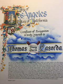
In contrast, designing illuminated letters similar to what Medieval monks produced has become a popular workshop course. The monks incorporated flowers, leaves, animals, and man-made objects such as ships and buildings into the small square that surrounded a letter. Albert Mirbasoo, a calligrapher who creates works for the City of Los Angeles, incorporates these kinds of images into the certificates for note-worthy people in LA. Learning to create the flourishes that enhance a letter is another creative opportunity for a calligrapher to customize their work.
 |
| Certificate award drawn by Albert Mirbasoo for the city of Los Angeles |
Check out these two websites for inspiration:
https://www.linkedin.com/in/albertmirbasoo/details/featured/
I absolutely love the embellished letter at the top of this post, Martha! Those oak leaves are so beautiful. Thanks for sharing your process, as always.
ReplyDeleteThank you, Teresa. I started making all the letters o the alphabet in this style. I got halfway through and then moved on. Now, that I looked at the H again, I want to go back to making more. Cards some day!
ReplyDelete