Friday, November 27, 2020

TOOLS OF THE TRADE


BYZANTOSH Alphabet, designed by Cherryl Moote, shown within her beautiful design work

Workshops inspire me. Recently, I watched with awe as Cherryl Moote showed her work with an alphabet, Byzantosh, that she designed. I joined with 20 others in her online calligraphy class offered by the Friends of Calligraphy to practice using the alphabet in different ways.

We spent the weekend playing with words. Here are a couple of samples:


Besides her calligraphic work, Cherryl showed us the tools she collects. Her array of tools reminded me of my own.

As an artist, I use all kinds of tools, including expected ones such as pencils and pens. It is even more fun to experiment with objects you might not think to use to make a mark on paper, such as sponges, screens, straw, corrugated cardboard or plastic, toothpicks, and rollers. All of these tools makes me think of the tools that other professions use: tools for cooking, for woodworking, for making music. What tools do you use?


Friday, November 20, 2020

WRITING CONNECTS US


by Martha Slavin


A to Z: The First Alphabet

A to Z: How Writing Changed the World

If you haven't seen this 2-part documentary yet, find it on PBS' NOVA. You will discover how writing and the need to share our thoughts changed our world, created a path to equality, led to our Constitution, and the development of computers.

We are wired to communicate with each other, share our ideas, and to make decisions together. Written language can be found in the pictorial writings in Ancient China, Mesopotamia, Mesoamerica, Ancient Egypt, and Indic scripts, which show us that from early civilizations, we needed to communicate with each other beyond our own small groups.

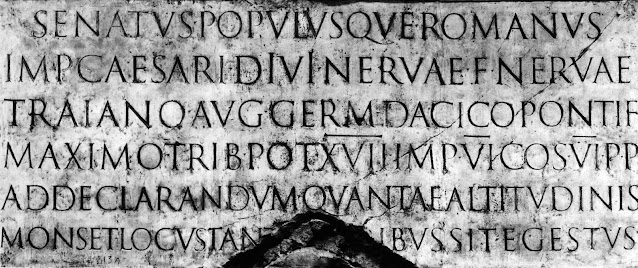
In ancient Rome, each of the letters of the Old Roman Alphabet began in a grid and then were carved in stone. The carvers made the letters easy to read and as permanent as stone can be. The Romans didn't stop with words carved on stone. Literacy was high throughout the culture because scribes used papyrus to write on. The papyrus surface helped the flow of writing. The scribes developed a cursive style that was easy to read while writing on papyrus with its smooth surface.


courtesy of the Historyofinformation.com


When the Roman Empire dissolved and sources of papyrus disappeared, scribes turned to parchment, which is made from animal skins. Because parchment has a different surface than papyrus, writing became more laborious and expensive to produce, thus limiting the number of people in the Western world who had access to the written word. Paper, invented in China, did not find its way West until the crusaders' conflicts with the Ottoman Empire. Not until Guttenberg developed a printing press with moveable metal type did reading become readily available in the Western world.

As in the West, social systems in China and other parts of the world created disparities in literacy. But progress in both China and in the Ottoman Empire led to Gutenberg's invention, which allowed ideas and materials to more easily spread around the world. Printing presses, for the most part, these days, are consigned to museums as we have become a digital world, but we continue to find ways to connect together so that our ideas flow from one group to another.

Those of us who learned to print and then connected letters into cursive may mourn the fact that cursive is no longer taught in most schools. Teaching cursive has even become a political issue just like so many of our other traditions. Most students now learn to print, usually making capital letters (going back to the Roman carvers?) They then easily switch to technology using their fingers to type on a computer or phone similar to traditional typesetters and typists. With the addition of voice apps, we continue to tell our stories wherever we can.

by Martha Slavin


Calligraphers all over the world keep writing by hand, incorporating technology to perfect the design process. They use apps such as PhotoShop or InDesign to clean up their work. When finished though, the documents showcase either precise hand lettering such as the document by Gemma Black for the Australian government to apologize to the indigenous people in their country or free-wheeling mark-making such as what you will see in the Friends of Calligraphy's journal Alphabet, if you click here: https://www.friendsofcalligraphy.org/pages/Alphabet46.1.pdf


by Gemma Black


Check out the calligraphy of   http://www.gemmablack.com  and https://www.brodyneuenschwander.com/2d-work/

Find PBS' NOVA episodes:  https://www.pbs.org/wgbh/nova/

Look into one of the many calligraphy guilds all over the world that actively encourage writing:  https://calligrafile.com/guilds-conferences-museums

Don't miss the International Print Museum's Virtual Printers Fair. You will find a celebration of the printed word:  https://www.printmuseum.org/event/2020-la-printers-fair/

More about the origins of handwriting, read Script and Scribble by Kitty Burns Florey https://www.abebooks.com/Script-Scribble-Rise-Fall-Handwriting-Florey/30604979309/bd

Are we so different than other animals?  Check out: Humans and other animals


Wednesday, November 11, 2020

LAST OF THE YEAR'S GOOD READS


Read any good books lately? 

I have a stack of good ones that have carried me through this year. My favorite so far is The Library Book by Susan Orleans. Orleans writes about the fire that almost destroyed the Los Angeles Central Public Library in 1986. You may have missed that news because the fire occurred on the same day as the Chernobyl meltdown in the Soviet Union. Her story reads like a novel as she investigates the origins of the fire itself, but also presents the history of the LA library from its beginnings in the late 1800s. She makes you realize what work goes into running a library, who the people are who run the library, how libraries have always and continue to be an important community resource. 


This seems to be a good year for odyssey-type stories involving pre-teen and teenagers.

Summerlings by Lisa Howorth is set in Washington, D.C., at the beginning of the Cold War. The people in the neighborhood where the children gather all have some secrets, which are gradually revealed.

This Tender Land by William Kent Krueger, whose usual tales are mysteries. This book instead is the odyssey of four orphans who run away from one of the Indian Training Schools in Minnesota during the Depression and who embark on adventures down the Minnesota and Mississippi Rivers in their attempt to return to St. Louis. A modern-day Huck Finn story with information about the training schools and the lives of the First Nations, who were forced to assimilate during that time.

Stay by Catherine Ryan Hyde who also wrote Pay It Forward. Stay revolves around two teenagers and their interactions with a woman who has been shunned by their small town. A good look at family relationships and the meaning of friendship.

The Nightwatchman by Louise Erdrich A novel based on Erdrich's grandfather who in the 1950s stood up to Congress to prevent the breaking of the treaty that guaranteed his tribe the reservation land in perpetuity.

Lastly, not a coming-of-age odyssey, but a story worth understanding:

Bryan Stevenson's Just Mercy. Stevenson established the Equal Justice Initiative, which works with low-income, wrongly accused people who had not received fair representation or trials.

What books are you reading? Use the comment page or email me marthaslavin@gmail.com with your suggestions.

Thursday, November 5, 2020

HARMONY


 Let's play.

Let's make art.

Let's take a moment for time for ourselves. Art is a healer of souls.

Art therapists encourage people to make art as a way to express their feelings. Art can provide meditative calm or it can be a way to let out anger, splashing that emotion on the page instead of at other people.

I tried watercolor this week and found myself returning to old habits of rushing to finish, of dabbing with my brush instead of with confident strokes, of pushing one color across the page instead of adding color with each stroke. In the end, I took the painting I made and cut off the piece I still liked, washed the color off the rest, and placed the cut-off piece in my bin for mixed media scraps. I then took a deep breath and looked at my collection of random pieces of paper.


I  thought of harmony, one of the principles of design along with balance, repetition, proportion, movement, contrast, and unity. These principles are what make a piece of art appealing to others. They have become intrinsic to me, but they underlay every piece that I work on whether it is a painting, print, mixed media piece, or hand lettering.

How do you learn to make these principles work for you? Collage art is an easy way to apply these principles. By taking a pile of random pieces of paper and moving them around the page, you will find yourself drawn to one layout over another. In my scrap heap, there are many pieces that I either think will be a valuable start to a design or were the wrong color, pattern, shape for the original purpose. I took a bunch of them today to see if I could create some way to find balance and harmony with disparate pieces. How can I tie them together to make a whole?


From my stack of scrap papers


First, I tried the repetition of shapes: squares and rectangles. Nope.


I added a circle. Nope


Removed some of the elements and added lettering. Nope.


Tried a paper with a circle cutout. Nope.


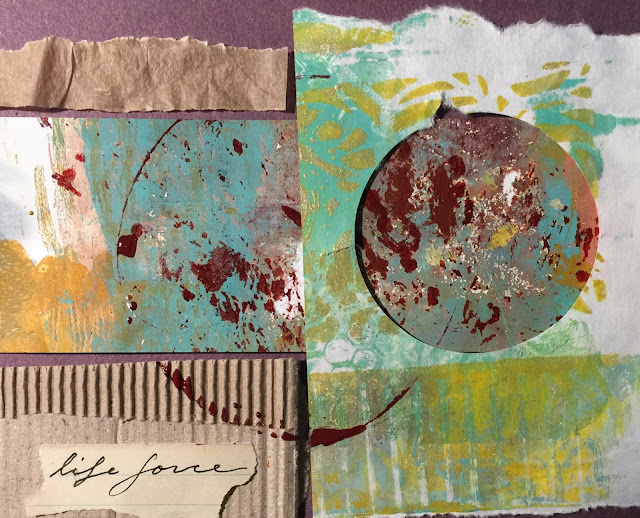
Added calligraphy and a larger circle to unify all the shapes. Getting there! 
I like the repetition of the vertical lines in the cardboard piece contrasting with the white lines on the right bottom corner. I like the yellow ochre, aqua, and magenta that run through the entire design, which helps your eye move around the page.
Circles always help. 
A few words do too.

This is a good week to tear up some paper, get out a paint box and brushes, find unusual tools, grab some glue, and begin. Take care of yourself.

****************


by MARTha Slavin

This piece is actually 4 small squares bunched together. Why do the four pieces work together? Repetition of patterns and lines, the green, blue-grey, and magenta that color each square, and the contrast between lights and darks.

This mixed media piece is included in Uppercase Magazine's #47 issue. Uppercase is a wonderfully creative magazine produced in Canada and filled with inspiring ideas. Take a look at issue #47 here: Uppercase Magazine #47