Friday, February 23, 2024

CIRCLES AND SQUARES: BASIC ELEMENTS

An unfinished Neurographic design  
What would you put in the square?

Instead of snow, much of California in February is covered with green. The hills sprout new lime-green grass as we receive more and more rain. The green surprises visitors from colder climates, especially if they have visited California during the summer, our dry season when the hills are brown.

This past weekend I attended Letters: California Style, a calligraphy conference organized by the Society of Calligraphers, held at Cal Poly Pomona, an oasis nestled in the hills in the LA Basin. I've gone to the conference since 2014 except for pandemic years and always come away flush with new ideas. Like I am, most of the attendees are older, nerdy women who enjoy expressing themselves through lettering and art. Cal Poly Pomona provides a perfect venue where we can sit in a classroom with floor-to-ceiling windows that give us a glimpse of the green hills and the budding fruit trees while we toil away like Medieval monks on a craft that takes concentration and precision.

This year I chose Cherryl Moote's class for creating art books. In other classes, attendees worked on improving their calligraphic and hand lettering skills with a choice of several other well-known calligraphy instructors, who also showcased their own work at our lunchtime gatherings. One of the teachers, Viktor Kams, began as a graffiti artist in Spain, then studied calligraphy, and is now a professional calligrapher and tattoo artist. He designs logos for businesses and anything that can contain his exquisite calligraphy including tattoos. He showed photos of some of his freshly made tattoos on the arms of clients. The designs were beautiful, but the clients' arms were still red from the procedure. You could feel the collective silent gasp of his audience, not a visible tattoo among them. Calligraphers have been around for a long time creating all kinds of lettering. Now, Kams represents the next generation of calligraphers who are interested in experimenting with their craft.

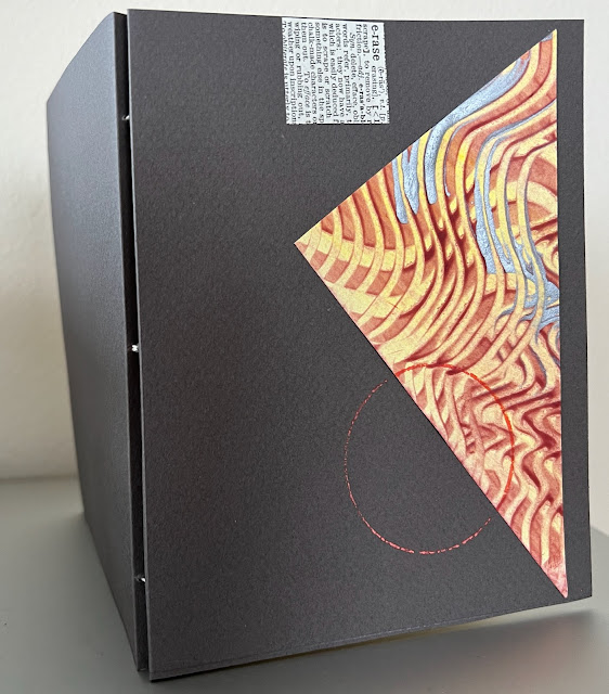
In Cherryl's class, we concentrated on creating unexpected art books. Unexpected, because we couldn't plan each page of our book. Instead, we started with a large sheet of paper, made designs all over the surface, and then folded and cut the paper into smaller book forms. We never knew what would happen once we folded the original design into smaller segments. The results were unexpected, amusing sometimes, and wonderful to view. Some people used colored inks, marking pens, and stamps to create images while others used paste papers, water-soluble crayons, and lettering to enhance their designs. Though we all used similar materials, no two books looked alike. In three days, we also made mock-ups of different ways of making a book including using a Lark's Head binding for heavy-weight paper, three versions of a two-minute book, accordion books, and a flat-style Australian reverse piano hinge binding, which takes longer to say than to make. Cherryl has written several easy-to-use books about various bookbinding techniques that can be found at John Neal Books online.


Designs on a large piece of paper using ink, scraps of paper,
tea splatters, and Cretacolor AquaGraph pencils


Two-Minute Book folded from the original large piece of paper


I came away from the conference with renewed enthusiasm for bookmaking, joy for having seen friends I hadn't seen in a long time, inspiration from the many works done by other attendees, and glad that my accidental choice for my Word for the Year is Unfinished. I brought home books that I will continue to work on and know that I have new ideas to try.


 Two Two-Minute signatures with Two-into-One Cover


Accordion book with doodles on a cover with neurographic lines


Accordion book with no lettering or cover yet


Mock-up for Lark's Head Binding


Check out Cherryl Moote's website:


Books available at John Neal Books:

Be amazed at the work of these calligraphers:

Viktor Kams:

Cora Pearl:

Wednesday, February 14, 2024

RANDOM PATHWAYS


The opening page from Postcards in the Air 2023 book


Pens run dry
just like a river in a drought
sometimes the pen fails:
words don't tumble out,
don't scratch across the surface.

Other times
a pen pushes ideas
across a page
swirling around rocks and boulders
of the mind,
creating small pools,
leading to new pathways
washing away dirt
to find what is hidden beneath.

I can't say I've ever experienced writer's block or artist's block. Early on, I learned that I needed to push through hesitation, think of everything as practice or an experiment, or pick up some other piece to try. Some days when I start and stop with ideas that don't pan out, I slip another page up onto my computer, start writing about something else, and keep doing that until I reach the kernel that had been waiting there in the shadows of my mind. I have heard of writers who get so stymied that nothing comes out. After ten years of writing this Friday blog, I am confident that some idea will percolate up out of the dregs. With a computer, I don't scrunch up a piece of paper and throw it into the wind. I can save those unfinished ideas in another file and maybe take them out to work them over again.

I'm more picky with myself with art. Coming from a family of artists, I have much to compare my work against. I have managed to rise above the self-doubt that creeps into creative work. I think of what I am doing as play, as practice, and that eases the doubt. I am lucky I do not earn my living with my work. I am always surprised and pleased when someone offers to buy one of my pieces, but that is not my goal. My art is my way to express my thoughts and feelings, and to develop more skills.

Sometimes simple ideas become the groundwork for something bigger. Since we moved to our new apartment in January, I have taken a photo every morning from the same spot looking out the window over Mission Creek and the buildings on the other side. The sun hits the windows of the buildings, creating brilliant jewels of light. The shadows of the morning slide down into the creek, and the birds begin to circle the water below. Some mornings grey clouds fill the sky, other times the sky is bright blue. The window spot has become a good place to start the day.


A friend invited us to a local ballet production. The company created a ballet in honor of Mary, her wife, who passed away a couple of years ago. Mary had been a big supporter of the ballet, and, among other things, was a certified clown. The ballet called Dr. Magic was a delight and focused on all the movements that clowns use at the same time presenting the love that people felt for Mary. The ballet was a wonderful way to pay tribute to someone who brought joy to others.


I started writing posts for this blog in 2012. The anniversary of my blog is in March. I only wrote nine posts in 2012 and 2013 so I consider 2014 to be the official start date since I wrote almost every week during that year.  Recently I found a blog publishing website that allows me to have a printed version of all my posts. The books look terrific. They are well-designed and formatted so that each post is easy to read. At the beginning of the book, the publishers have pulled a collage of the photos I've used within the year. You can see the pages at the top of this post. I am pleased with the result and so glad that people continue to read my blog posts. Thank you!


**************

An important documentary, 20 Days in Mariupol, is well worth watching. A good reminder of what is at stake in Ukraine.


Friday, February 9, 2024

GOOD WORDS NOT FORGOTTEN


When was the last time you heard someone say, Hogwash, or Balderdash, Bullpucky, Razzamatazz, Fudgel, Dillydally, Lollygag, or Tin Whistle? Did you know that a Tin Whistle is a kind of Fipple Flute along with the recorder and flageolet? Have you ever heard of a fipple flute or flageolet? I hadn't, but I love the alliteration when I say these "F" words.
    If you look up the origins of these colorful words, you will find some interesting connections. Some are replacements for swear words or as "lollygag" was once used, as a euphemism for love-making. Lollygag became a word that means to waste time instead. Hum.
    Reading Kory Stamper's Word by Word, the Secret Life of Dictionaries, reawakened an interest in the origin of words. English is such a versatile language that words change meanings and usage over time. That's why we have lexicographers who painstakingly create the definitions found in our dictionaries to help us keep track of what a word means.


Sakura: Signs of Spring


    The meaning of an acronym can also change over time. LOL used to mean Little Old Lady, but now it's Laugh Out Loud, what will its next iteration be? In our hurried-up world, words that are too long become acronyms instead, such as Post-Modernism shortened POMO, OMG instead of Oh My God, and FOMO or Fear of Missing Out. The use of acronyms flourishes in the English language because it accepts change and adapts to new meanings.
    Other languages have different ways of dealing with new words and meanings. In France, any new word needs to be formally approved by the Academie francaise before it appears in their official dictionary. Yet, in everyday use, foreign words creep into French, "weekend" and "smartphone" being prime examples.
    The Japanese use three different alphabets to create words. First, The Japanese used kanji, the original written language borrowed from Korea and China. Kanji is an ideogram version of writing and includes both sound and meaning within the word. A good example is the word "Mori", which means forest. Mori repeats the symbol for tree three times and looks like a forest.


    Hiragana and Katagana, the other two alphabets developed by the Japanese, have different purposes and are syllabic. Hi ra ga na and ka ta ga na are easy to pronounce once the syllables are separated. Hiragana is a placeholder between nouns and used at the end of sentences. Katagana is used to make the written expression of foreign words.
    Cherry blossoms (sakura) are a significant part of Japanese culture because they appear at the beginning of Spring and are transient. People gather for cherry blossom viewing parties and watch as the buds turn to blossoms and then the blossoms fall and cover the ground like pink snow. I found this Japanese word for the changing nature of life which includes the symbol for cherry blossom:

Mi kka mi nu ma no sa ku ra


The last character of this word stands for sakura (cherry blossom). Can you see the tree? There is also the symbol for female within the symbol:


That's the beauty of discovering the origins of words I hadn't known or used before.

***************

Thanks to these four delightful books that inspired this post:

Kory Stamper, Word by Word: the Secret Life of Dictionaries
Joe Gilliard, The Little Book of Lost Words
Yee-Lum Mak, Other Wordly
John Koenig, The Dictionary of Obscure Sorrows

All four are available at https://bookshop.org

**************

Looking for something to make for Valentine's Day? Check out my Project Directions page. 


Happy Valentine's Day!


Friday, February 2, 2024

SEEING RED

Kuratake watercolor reds and blues


 Among all the colors on a watercolor palette, I find red to be one of the hardest to use. Red often becomes too bright, too bold, attention-getting, or too muddied and dark and not easy to pick up with a Magic Eraser or wet Viva towel. I have to be careful where I paint it. A small spot of red will draw the eye and stop there. In this quick sketch below, I used sprays and dabs of watered-down red to lead the eye across the page. The red anchors the black marks and helps to give the sketch depth.


When I make abstract calligraphic pieces, red is a useful tool. One small square somewhere in the mark-making anchors the abstract strokes.


Like all colors on the color wheel, red has warm and cool variations. I gravitate towards the cooler versions since I tend to paint with colors that are mixed together, greyer, and quieter than something right out of the tube. I have to be careful mixing red into other colors on my palette. Just a small spot of red can overwhelm other colors. Adding a touch of red to blue makes a good tone for clouds or shadows.


I found a small dried-up blob of red watercolor in an old palette tray and put it in some water to see what would happen. Once the red blob dissolved, the result was red water, of course. Could I do anything with that red water? I put it into a spare bottle and sprayed it across part of an unfinished watercolor. Too much light red  (pink!) splatter. I wiped it off before it had time to dry. I brushed six small red squares on a page in my art journal and dropped some ultramarine blue onto the wet surfaces. The blue mixed and fanned out on the wet red surface.


I thought about those squares and couldn't come up with a way to use them in a painting so I decided to try to use the red tinted paper as background for sketches. I had watched from my window seagulls, crows, and pigeons stand as sentinels on the corners of the buildings like the gargoyles of Medieval cathedrals. Sparrows and finches lined up along the edges too. I wanted to remember those images. I used the squares to draw small versions of what I'd seen and painted them with regular watercolor. I used gouache, and white and yellow colored pencils to cover some of the pink areas and to make the birds' beaks stand out. Making art is a process of trial and mistakes to help me decide if the attempt is successful or not. In this case, it was a good experiment, but one that I probably will not use again. The red water will be good for our two indoor plants.


Painting with red as part of an exercise in Birgit O'Connor's watercolor class