Friday, May 28, 2021

A SPARK OF INTEREST


Practice sheet of broad-edged pen lettering


You never know where an experience, object, or person will lead you.

An old bottle of Higgins India ink props up books on a shelf in my workroom. I haven't opened the bottle since I retrieved it from my parents' home. My dad used India ink daily for his work and this bottle belonged to him. 


My sister and I would often sit in his studio and draw with ink and ink pens. We practiced with the penholders and nibs from the Speedball Artist set we had.


We used the Speedball Textbook, a small booklet that showed how to hold a pen, how to draw different alphabet styles, and where to start each letter.


Sample page from the 20th edition of the Speedball Textbook


I thought of those earlier times while attending Letters of Joy, the calligraphy conference I Zoomed recently. Randall M. Hasson, the guest speaker, talked about his experience as the 24th co-editor of the Speedball Textbook. Hasson was a fountain of information about the invention in the early twentieth century of the Speedball nib by Ross F. George and William H. Gordan, both Sho-card artists. Their patented tool changed the world for artists who drew the advertising posters that hung in store windows all over the world. These artists also hand-lettered the dialogue cards in silent movies. They were an important part of commerce.

Because the signs changed daily, the Sho-card artists needed to be fast. Many artists used either brushes or broad-edged pens. These tools weren't quick enough. George and Gordan developed the Speedball nib as a way to speed up their work. They bent the end of the nib so that drawing monoline lettering became very quick. They attached a piece of metal to their nibs that created a small reservoir that could be filled with ink. Once they figured out the new pen nib, they designed different types of nibs for different types of alphabets.


A, B & D Speedball pen nibs for Monoline lettering


Silent Movie Dialogue Card hand-lettered
courtesy of pinterest (stayonfountain.com)


 Gordan and George created a book filled with tips to help artists learn to draw each letter or alphabet. Every ten years or so, the small book is updated with modern examples. Speedball is now on its 25th edition. Carl Rohrs, Sachin Shah, and Suzanne Cunningham, the latest co-editors, changed the look of the book from the 24th edition designed by Angela Vangalis and Randall W. Hasson. Both are brimming with good information. Which cover do you like better?

The 25th and 24th editions


The speedball Artist Set was my first tool for learning hand-lettering. I still have my copy of the textbook. I learned letter spacing, pen slant, and the difference between monoline lettering, Broad-edge pen lettering, and pointed pen calligraphy. I discovered as a left-hander that pointed pen and broad-edged pen styles with their thick and thin lines are more difficult for me than monoline, whose letters are the same width throughout.


Monoline lettering


Thick and thin letters that could be done with a broad-edged pen.
I did this with colored pencils instead.


Listening to Randall Hasson speak of his experiences with the Speedball company made me reflect on my own interest in graphic design and lettering and how much I was influenced by the pages of a simple booklet about lettering.


Check out the Speedball website. You can arrange a tour of their factory where they still make pen nibs by hand:


Friday, May 21, 2021

UNINVITED GUESTS


 "A weed is just a plant that is in the wrong place."

How often do you think of that expression as you pull up the rush of weeds that appear in Spring? 

Weeds poke up in so many uninvited places. I use shots of vinegar to spot-kill them where I don't want them. I aggressively go after oxalis that could cover our backyard in no time. And then I laugh when I see a species of oxalis offered at the local nursery. Plant or weed? Even plants that I put in can take over a yard. I'm now cutting back pretty Ajuga, another aggressive grower which I planted, which climbs over other more delicate plants and buries them under its spreading leaves. 


Plant or weed? Are they weeds because they have too many stickers, thorns, pants-grabbers, or tendrils that snake out all over the yard, or are they a weed because they are just not beautiful? 


We often find volunteers in our yard, some like the rhododendron in the photo, we kept. It is the only one of our Rhodies that still flower each Spring. Plant or weed?


I used to have a small, contained area of Forget-Me-Nots (it's good to pay attention to informal names) that produced summer-long displays of sweet blue flowers. The seeds, though, would catch on gloves, pants, and animal fur. I never saw volunteers in other parts of the yard until I pulled the contained bunch out. Now, even years later, I often see the beginnings of a Forget-Me-Not trying to make its presence felt in the yard. They are persistent.


A walk up the street brought my attention to other weeds. I like the bird's eye view looking down at weeds. They are more interesting from above. I can see the symmetry of the plant. On one part of my walk, the purple flowers in a gathering of tall thistles have begun to bloom. The variegated, thorny leaves keep adversaries away or allow the plant to hitch a ride to another place to grow. They find the smallest cracks in the concrete where they can start again.


Grass Spider webs

This week hundreds of spiderwebs, like pieces of lace flung across the grasses, cover the hills. Each web has a small hole or funnel where the spider hides ready to snag any insects fooled by the web. Today the webs caught the dew from the drizzle that made everything outside feel damp. 


Too often I've removed something from our yard only to learn later of its worth. That is why I've stepped around two mating snails this morning. Usually, I pick them up and toss them over the fence into the fields beyond or into the street because in large numbers they can be so destructive to delicate plants. Because of their antioxidant properties, many cultures consider them a delicacy I've never been interested in that particular culinary experience, but some years I feel that our yard, especially in Spring, is a snail farm.


Four good writers about gardening and being in nature:

Beverley Nichols, Rhapsody in Green (the best of his many books)
Stanley Kunitz, The Wild Braid
Dominique Browning, Paths of Desire
Sam Keen, Sightings

Check them out at https://www.goodreads.com


Friday, May 14, 2021

A to Z


When I used to ski, I liked to take a lesson in the morning to warm up and to get over my fear of heights and speed. Skiing behind the instructor, I would replicate the same maneuvers knowing that I wouldn't try them first on my own. If I focused on the instructor's moves instead of my own fears, I could slide down the sides of moguls, ski the gullies between the moguls, and manage to ski down every run at Squaw Valley except the West Face of KT22 without losing my balance, falling, and sitting terrified as I looked down at the height and the steep slope I was sitting on (I had plenty of those experiences too.)


Taking art classes gives me the same sense of confidence. At some point though, I know I need to step away from the instructor's style to establish my own way of working. I've found that true in watercolor as well as calligraphy.

I've been concentrating on those two media for the past couple of years. Though I see progress in both areas, I still get frustrated when something doesn't turn out the way I had hoped. My solution for that: try something else. This weekend I stepped away from watercolors and picked a class using colored pencils with Jane Shibata, a master calligrapher, artist, and teacher. She showed us how to use various colored pencil techniques to create hand lettering and calligraphy. Using colored pencils took me back a long way, such a long way that I began leafing through old sketchbooks looking for unfinished examples of work that I could use with colored pencils.

I found an alphabet I had designed but never took beyond the drafting stage. The alphabet was perfect for colored pencils, and I will have till next Valentine's Day to finish them.


During the class, I filled three pages with Shibata's exercises. I don't have regular colored pencils, whose binder is either wax or oil. Instead, I have a collection of watercolor pencils that I have for adding color to sketches and that have a water-based binder. I just need to add water with a waterbrush to activate the colors to make them look like watercolor paints. Shibata talked about wax bloom, which appears on colored pencil drawings because of the wax binder. She suggested using a fixative. When I was finished for the day, I decided to seal the exercises with fixative. I picked up my bottle of fixative and without testing, sprayed my papers and watched as the liquid fixative affected the watercolor pencil marks just as a waterbrush would do. Being an artist isn't for wimps.


One sheet of exercises before fixative spray,
 before the colored pencils ran.

I know it will be good practice to do the exercises all over again. I also now have a set of Blackwing colored pencils. Blackwing is a Japanese company known for its graphite pencils. The colored pencils have the same soft, creamy feel to them as their other pencils. They remind me of Kuretake Gansai Tambi's watercolor pans, which also have a rich creamy feel to them (unlike most watercolor pans).


Two letters are done, 24 to go


To find examples of Jane Shibata's work, click this Google search link:

https://www.google.com/search?rls=en&source=univ&tbm=isch&q=jane+shibata&safe=active&client=safari&sa=X&ved=2ahUKEwjjy_GBiMfwAhWYvJ4KHdqWDZ0Q7Al6BAgHEDU&biw=1768&bih=1286#imgrc=LlsA6oFwMAeexM 

Friday, May 7, 2021

CREATING IN CIRCLES

"Being an artist is not for wimps," a friend recently said.


 One of the best lessons I've learned from doing creative work: stepping away from the work helps give my mind a chance to change directions and look at the problem in a new way.

I Zoomed Letters of Joy this past weekend. Letters of Joy (what a perfect title) is a one-day calligraphy conference in Edmonton, Washington, that I first attended six years ago. I picked the conference the first time because it lasted one day, which gave me a chance to spend time in Seattle for a long weekend. I drove from Seattle to Edmonton to a community college for the event sponsored by the Write On Calligraphy guild. I took three short classes that didn't require great calligraphic skills so that I could get back into lettering after a long hiatus. I met interesting people, signed up for decorated envelope exchanges, and shopped at the art supplies store set up in the meeting hall. The event inspired me to continue to pursue my love of hand lettering and calligraphy and I returned for several years. Last year's conference was canceled, but this year the organizers placed everything on Zoom.

I signed up for a workshop with Laura Norton, who demonstrated how to produce finished pencil lettering with various shapes. She suggested meditative exercises that helped us to understand how to make the lettering she uses. We spent time drawing inch-long lines using various weights of pencils while using different degrees of pressure so that the lines became thicker and thinner as we drew. Laura then encouraged us to draw large shapes such as circles, teardrops, or squares and to fill these shapes with quotes we liked, using lettering based on the thick and thin lines we had been practicing.


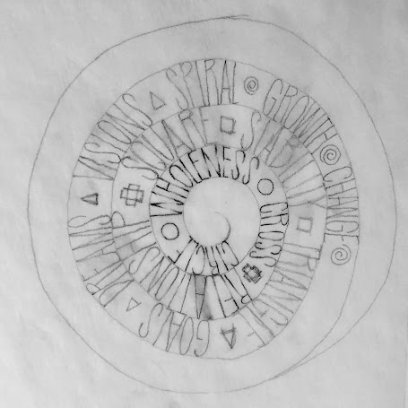
I immediately chose a circle as the outside framework, making it as tough on myself as possible. I thought of the signs of life, which I had first encountered in Japan and which I read about in a book by Angeles Arrien. I wanted to make a piece about the universal symbols that appear in every culture: the circle, square, triangle, spiral, and cross. I tried several different versions, never satisfied with the results. I walked away.


This morning I woke up and realized that the format, both the circle and the light pencil, didn't work for the philosophical weight of the five signs. For the symbols, I needed a more abstract design that shows the importance of the five signs themselves. I'm still working on that piece. 

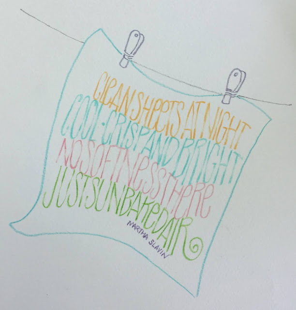
I decided to use the pencil lettering for other more light-hearted sayings: 


 Good tips from Laura about working in circles or spirals: turn the page after each letter. That way the next letter seems to be on a straight line and the angles of the letters don't become distorted. Also, since this is pencil, using a piece of paper under your drawing hand keeps you from smearing the marks, something I always forget to do, much to my consternation.


To see Laura Norton's work:

https://www.lettersaloft.com/about

To learn about Write On Calligraphers, one of many calligraphy guilds in the U.S., look here:

http://writeoncalligraphers.org

And if you are interested in learning how to use a Bent Nib, take Randall Hasson's class offered through Write On Calligraphers or at Sandia Workshops. He's a terrific teacher.

https://sandiaworkshops.art/hasson-bent-nib/